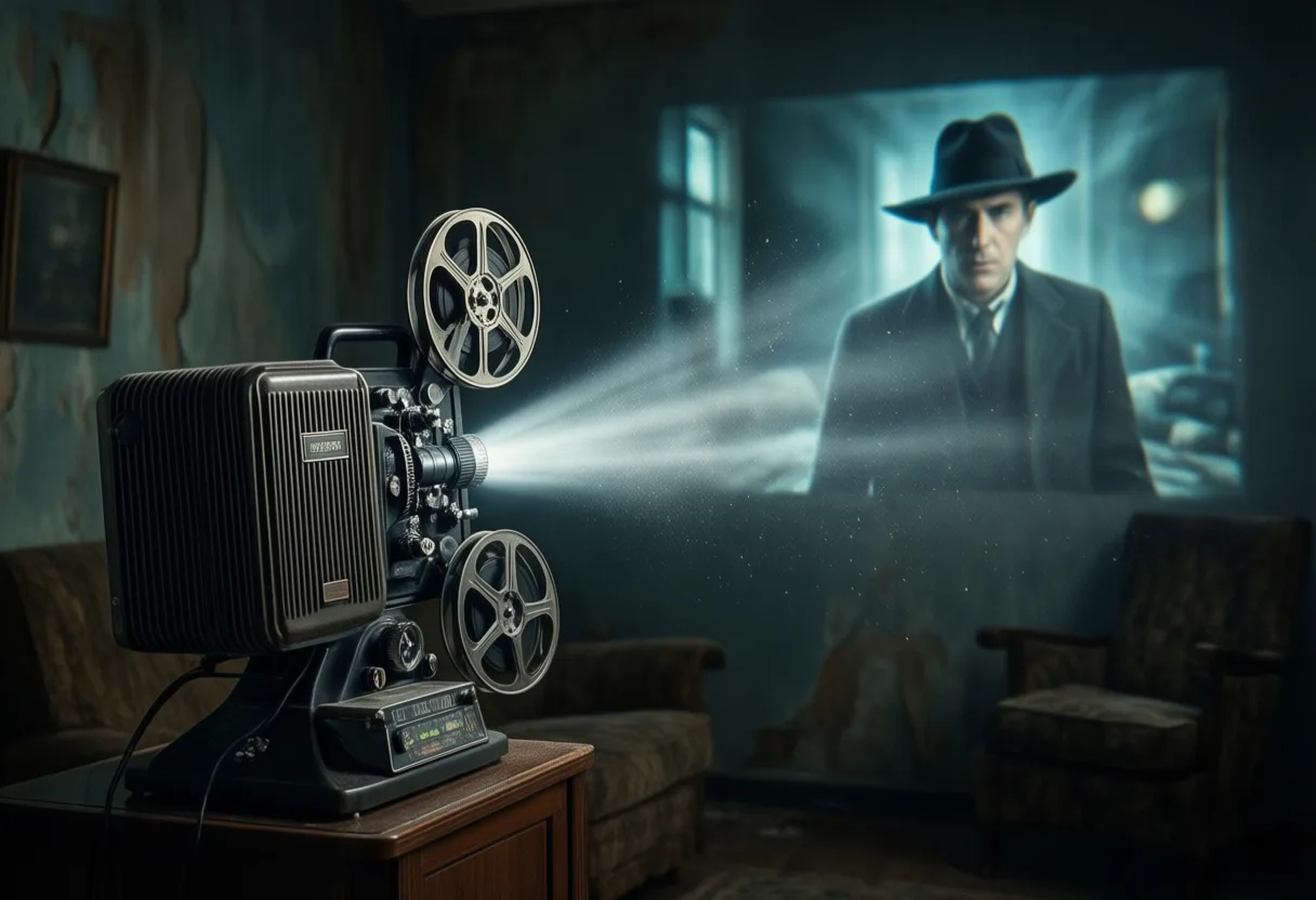
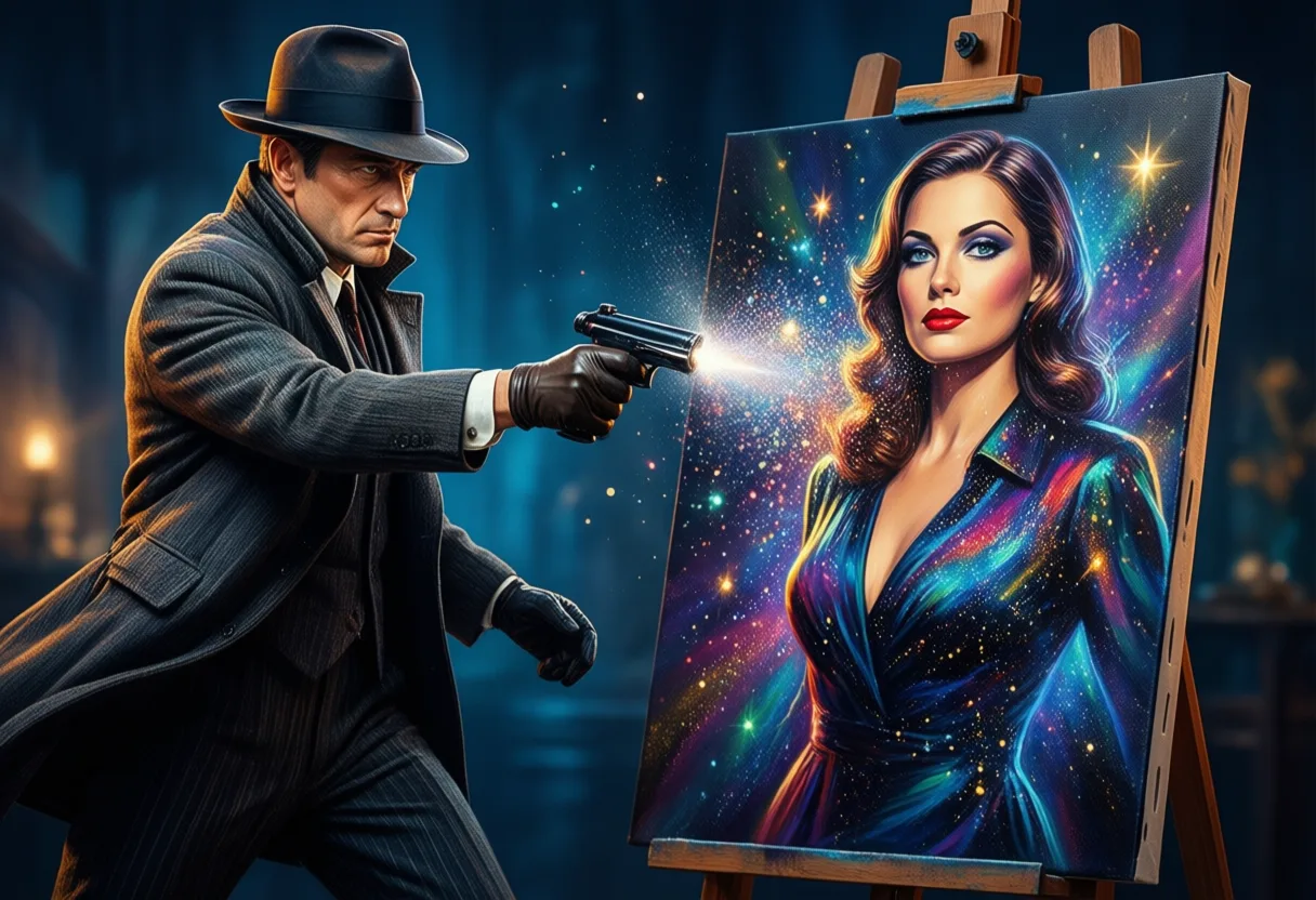
A good poster doesn’t just sell a movie-it sells a dream. And in the Golden age Of cinema, that dream was painted, airbrushed, and hand-lettered with a swagger that today’s algorithms can’t replicate.
These weren’t just advertisements. They were promises wrapped in bold colors, impossible poses, and faces that seemed too perfect to belong to mere mortals.
The Visual Language of Vintage Cinema
Back when moviegoers didn’t have trailers autoplaying on their phones, the poster was the first-and sometimes only-glimpse of a film. It had to do heavy lifting: establish tone, sell stars, and ignite curiosity, all within a single frame.
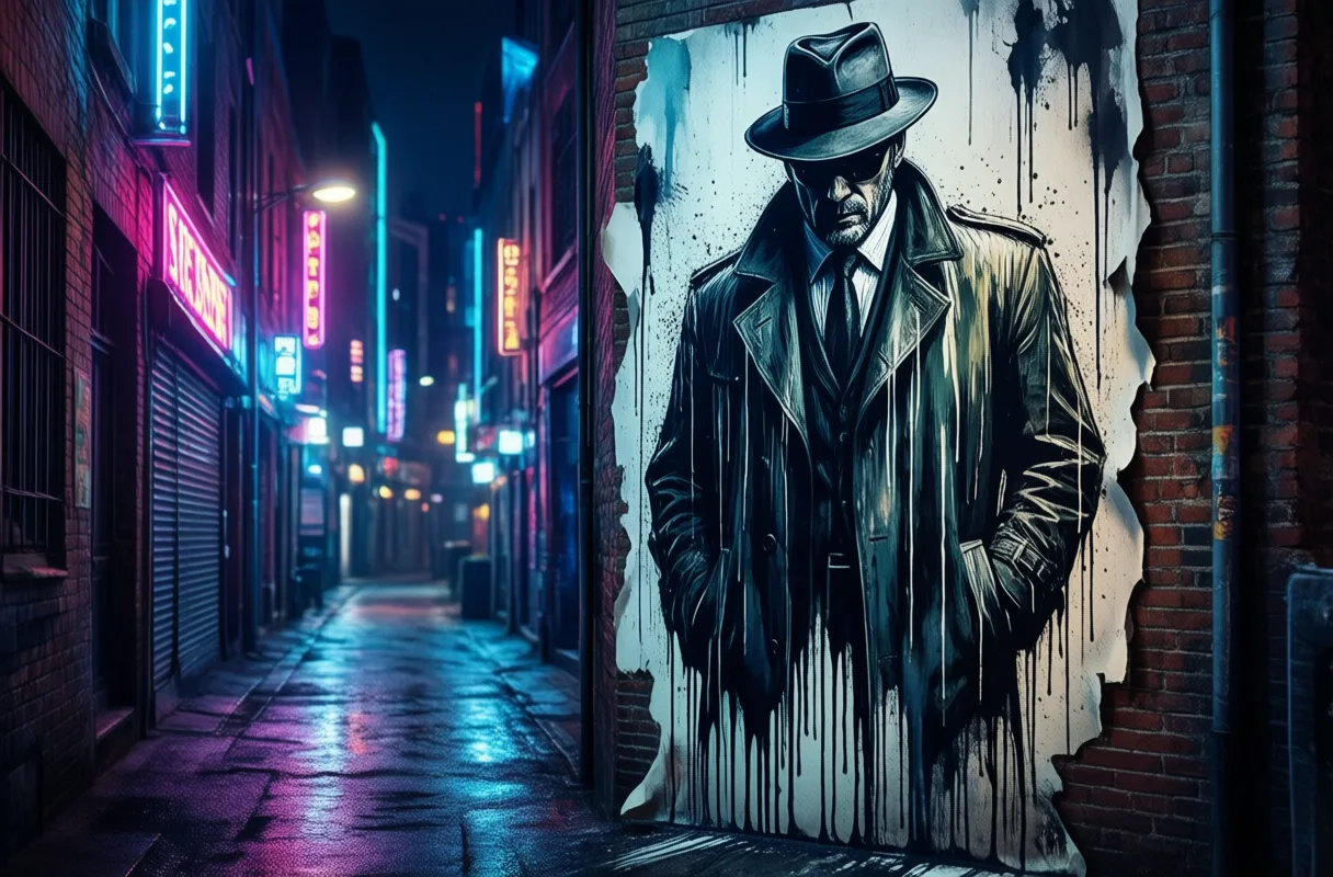
Studios treated posters like psychological bait. A slight arch of an eyebrow, a Shadow across A forehead, the way a fedora tilted just so-these weren’t accidents. They were calculated gestures, designed to suggest danger, desire, or destiny.
Think of the noir posters where a man in a trench coat stands half in shadow, a cigarette dangling from his lips, while a Woman In red silk looms behind him like a bad decision waiting to happen. The image told you everything: This isn’t a love story. It’s a downfall.
Posters from the 1930s through the 1960s didn’t just Reflect films-they amplified them. They took the subtext and made it neon. A romantic drama became a tempest of longing; a war picture turned into a monument to sacrifice. The art wasn’t always accurate, but it was always Intentional.
Even comedies got the grand treatment. A screwball farce might feature the leads mid-tumble, hair askew, eyes wide with comic panic-because nothing says “hilarious misunderstanding” like two people falling down a staircase in perfect synchronization.
The visuals weren’t subtle, and they didn’t have to be. This was mass communication in an era before mass distraction. You saw the poster in the theater lobby or tacked to a telephone pole, and for a few seconds, you were transported.
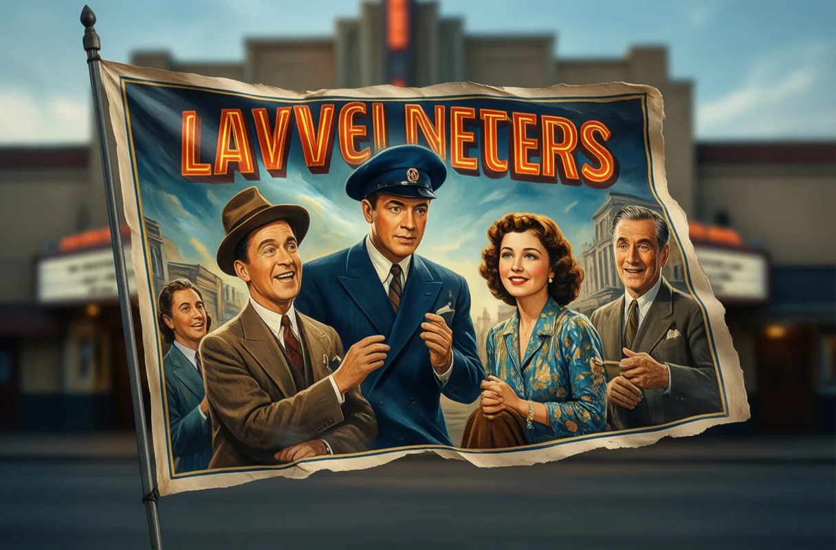
From Lobby Cards to Icon ic Imagery
Long before social media campaigns and viral teasers, studios relied on a suite of printed materials to sell their films. Lobby cards, window cards, one-sheets-each had a role, a size, and a purpose.
The one-sheet, usually 27 by 41 inches, was the star of the show. It hung outside theaters, slapped on kiosks and bus stops, screaming for attention in crowded urban landscapes.
Then there were the lobby cards-smaller, often sold in sets of eight-that lined the walls inside the theater. These weren’t just promotional tools; they were collectibles, souvenirs of the experience. Kids would sneak them home, tuck them under mattresses, tape them to bedroom walls.
Some of these images outlived the films they advertised. A movie might fade into obscurity, but its poster? That could become iconic. The face of Some Like It Hot Might be remembered more for Tony Curtis and Jack Lemmon in drag, grinning under feather boas, than for any particular punchline in the script.
And let’s not forget the taglines. “How far would you go for a thrill?” Or “He had everything a man could want-except peace of mind.” These weren’t just captions-they were mini-dramas, written in italics and set against dramatic skies.
The best posters didn’t just summarize a film-they reimagined it. They stripped away the mundane and left only the myth. A courtroom drama became a battle of titans. A musical turned into a whirlwind of sequins and yearning.
Even when the movie underdelivered, the poster often didn’t. It existed in a parallel universe where every frame was perfect, every emotion heightened, every star immortal.
Color, Type, and Composition: Decoding the Aesthetic Rules
There were unwritten rules to Classic poster Design, and they were broken only by the boldest studios-or the most desperate.
First rule: the star’s face always dominated. If you had a bankable name, you put that face front and center, preferably gazing off into the middle distance like they were contemplating the meaning of life-or their next royalty check.
Color wasn’t chosen for realism. It was chosen for Impact. Deep reds for passion, icy blues for melancholy, sickly yellows for suspense. A horror film might bathe its monster in greenish light, not because it made sense, but because it made your skin crawl.
Typography was its own art form. Fonts had personality-swirling scripts for romance, blocky sans-serifs for war epics, jagged lettering for horror. The title wasn’t just text; it was part of the image, often integrated into the scene like a neon sign in a dream.
Composition followed a kind of cinematic geometry. The rule of thirds? Often ignored. Instead, you’d get dramatic close-ups, tilted angles, or figures crammed into the foreground while the background blurred into abstraction.
- A lone cowboy on a ridge, backlit by a blood-orange sunset
- A woman in a strapless gown, clutching her pearls as if someone had just whispered a secret
- A spaceship looming over a city, twice the size it should be, because scale was less important than awe
These weren’t mistakes. They were Statements. Accuracy was for still photographers. Posters were about emotion, not documentation.
And let’s talk about proportions-because no one in these posters had a Normal body. Legs were longer, jaws sharper, eyes more luminous. These were idealized versions of people, airbrushed into godhood.
Even the borders had meaning. Ornate frames suggested prestige. Cracked textures hinted at danger. A simple slash of color across the bottom? That was where the tagline lived, like a punchline waiting to drop.
Myth vs. Memory: What Posters Promised vs. What Films Delivered
Here’s the dirty little secret: the poster often lied. Not maliciously-just Enthusiastically.
A quiet character study might be sold as a sweeping romance, with the leads locked in a clinch they never actually shared on screen. A gritty war film could be rebranded as a heroic saga, all muscled torsos and exploding tanks, even if most of the movie took place in a bunker.
The poster wasn’t a review. It was a seduction. And like any good seducer, it emphasized the best angles and downplayed the flaws.
Remember that moody thriller with the detective staring into the rain? The poster made it look like a meditation on loneliness and corruption. The movie? Mostly paperwork and a car chase in Act III.
But did it matter? Not really. Audiences didn’t go in expecting documentaries. They went in expecting Feeling. And if the poster made them feel something before they even bought a ticket, the studio had already won.
Sometimes the disconnect was hilarious. A wholesome family adventure might be illustrated with the kids dangling from a cliff, wolves circling below-despite the film being 90 minutes of singing and pie-eating.
Other times, the exaggeration worked in the film’s favor. The poster set such a strong tone that viewers Projected That intensity onto the movie, even if it wasn’t fully earned.
And let’s be honest-some films were saved by their posters. A mediocre script, a sluggish pace, a forgettable score. But that image? That one bold, striking image? That’s what people remembered.
The gap between promise and delivery wasn’t a flaw. It was part of the magic. Cinema has always been about illusion, and the poster was the first trick in the act.
Global Variations, Local Flair
While Hollywood set the template, other countries rewrote the rules with flair and ferocity.
In Italy, posters for American films often looked like fever dreams-wild colors, exaggerated poses, and compositions that made no literal sense but felt emotionally true. A Western might feature six gunmen floating in the sky like saints in a Renaissance painting.
Japan took a different approach. Their Banzai Posters were intricate, detailed, and often included scenes that never appeared in the film-because why show what happened when you could show what Should Have happened?
French artists treated movie posters like fine art. Minimalist, elegant, often more interested in mood than marketing. A Hitchcock thriller might be reduced to a single eye, a key, and a shadow on a wall.
In India, Bollywood posters were explosions of color and movement. Stars multiplied across the frame, dancing, fighting, weeping-all in the same image. Reality was optional; spectacle was mandatory.
Even within the U.S., regional variations popped up. A poster in Chicago might emphasize drama, while the same film’s New York version leaned into glamour, and the Los Angeles print highlighted the star’s real-life romance.
These weren’t just translations. They were reinterpretations. Each culture filtered the film through its own visual language, its own desires, its own sense of what was exciting.
And in doing so, they proved something essential: a movie isn’t just what’s on screen. It’s also what we imagine it to be-and the poster is the match that lights the fire.
Artists Behind the Curtain
The men and women who painted these images rarely got top billing. No red carpets, no Oscar nods. Just deadlines, revisions, and the occasional byline in tiny print.
But their influence was enormous. These artists weren’t just illustrators-they were visual storytellers, condensing hours of narrative into a single, unforgettable image.
Some worked in studios, churning out posters under tight supervision. Others freelanced, bringing their own style to whatever project came their way. A few became legends, their names whispered by collectors and cinephiles.
They used brushes, airbrushes, gouache, and ink. No digital layers, no undo button. One slip, and you started over.
Many of the best were trained in fine art but found steady work in commercial illustration. They brought classical techniques to pop culture-chiaroscuro lighting, masterful anatomy, a painter’s eye for composition.
And they had to be fast. A studio might need a finished poster in days, sometimes hours. The pressure was real, the pay often wasn’t.
Yet look at the results: a woman in a white dress standing on a windswept beach, a spaceship shaped like a skull, a detective’s face half in shadow, half in flame. These weren’t just assignments. They were acts of imagination.
Today, original posters sell for thousands, sometimes tens of thousands, at auction. The art that once hung in dusty lobbies is now framed in galleries.
It’s a late tribute, but a deserved one. These artists didn’t just sell movies. They helped define how we remember them.

Legacy in the Digital Age
Now, most movie posters are made on computers, assembled from photos, filters, and font libraries. They’re efficient, scalable, and instantly shareable.
But something’s been lost. The texture. The hand. The sense that a real person once sat at a desk, brush in hand, trying to capture lightning in a bottle.
Digital design allows for precision, but not always soul. Too many modern posters look the same-faces crammed together, desaturated colors, a generic “gritty” filter applied like cheap cologne.
The one-sheet used to be an event. Now it’s a thumbnail. Shrunk down to the size of a postage stamp on a phone screen, stripped of detail, stripped of impact.
Yet the old style refuses to die. Look at the marketing for a retro throwback like a Mission: Impossible Or Knives Out Film, and you’ll often see nods to mid-century design-bold type, dramatic lighting, a single striking image.
Indie filmmakers, in particular, have embraced the classic look. When you don’t have a hundred-million-dollar budget, a great poster can do half the work.
And let’s not forget the collectors. Original vintage posters are now prized artifacts, bought and sold like rare books or vintage records.
Even in the age of algorithms, there’s still power in a single, well-crafted image. We scroll past hundreds of digital ads a day, but one bold, strange, beautiful poster can stop us cold.
Because it doesn’t just say, “Watch this movie.” It says, “Step into this world.”
Why These Images Still Matter
A great poster doesn’t age. It evolves.
It becomes a relic, a souvenir, a piece of cultural DNA. You see it years later, and it doesn’t just remind you of the film-it reminds you of how you Felt When you first saw it.
That’s the magic. These images weren’t just selling tickets. They were selling moments. Anticipation. Escape. The thrill of the unknown.
They captured the romance of cinema at a time when going to the movies was still an Event-not just something you do while scrolling through a menu.
And in an age of endless content, where films vanish into the void days after release, the classic poster stands as a monument. A single image that says: This mattered.
It didn’t need likes or shares. It just needed to hang on a wall and dare you to look away.
That’s why we still care. Not because they were accurate. Not because they were honest. But because they were Alive-painted with passion, sold with swagger, and remembered long after the credits rolled.
| Region | Style Characteristics | Notable Features |
|---|---|---|
| Italy | Fever-dream compositions, wild colors | Floating figures, emotionally true but illogical scenes |
| Japan | Intricate, detailed illustrations | Scenes invented for drama, not shown in films |
| France | Minimalist, elegant, mood-focused | Symbolic elements like shadows, eyes, keys |
| India (Bollywood) | Explosions of color and movement | Multiple actions per image: dancing, fighting, weeping |
| United States | Star-focused, dramatic lighting | Regional variations in drama, glamour, or romance emphasis |
The Hidden Stories Behind Iconic Film Art
More Than Just a Pretty Picture
Movie posters from the golden age of cinema weren’t just advertisements-they were handcrafted works of art that often told a story all their own. Before the digital age, artists used paint, ink, and airbrush to create dramatic, exaggerated images that captured the mood of a film, sometimes even inventing scenes that never appeared on screen. These illustrations were designed to grab attention from a distance, using bold colors, dynamic poses, and expressive faces to draw audiences into theaters. The result? Images so powerful they’ve become more iconic than the films themselves in some cases.
Art That Broke the Mold
Some of the most famous posters were born from happy accidents or last-minute changes. The legendary one-sheet for Casablanca Wasn’t even created until months after the film premiered, yet it’s now one of the most recognized designs in history. Artists like Drew Struzan and Reynold Brown became household names among collectors, their signature styles turning posters into sought-after collectibles. In the 1950s and 60s, it wasn’t uncommon for studios to use the same model across multiple posters-meaning the same face might appear as both a damsel in distress and a space alien in different campaigns. These posters didn’t just promote movies-they shaped how audiences imagined them.
Frequently Asked Questions
What was the purpose of classic movie posters?
Classic movie posters were designed to sell a dream, establish tone, sell stars, and ignite curiosity. They acted as psychological bait, using calculated visuals to suggest danger, desire, or destiny.
How did vintage poster artists create their work?
Artists used brushes, airbrushes, gouache, and ink to handcraft posters without digital tools. They worked under tight deadlines, often creating images that never appeared in the films themselves.
Why are some classic movie posters more iconic than the films they advertised?
Posters amplified film subtext into neon, reimagining stories with bold emotion and mythic scale. Some outlived their films by becoming cultural relics that captured audience imagination.
How do classic posters differ from modern digital ones?
Classic posters were hand-painted with texture and soul, while many modern posters are digitally assembled, often using similar templates, desaturated colors, and crowded faces that lack unique artistry.
This article was produced with AI assistance. How Silver Screen Magazine uses AI.
Rohan Kilpatrick dissects the personal lives of stars with wit and precision, balancing insider access with ethical awareness. He delivers the latest whispers and headlines with a sharp eye for irony, never sacrificing style for sensationalism.